
Pale pink in the home
Pale pink is a colour which is much derided as being girly, childish, too sweet and generally not serious.
However, I think that if it is used sensitively it can work wonderfully, as these stylish rooms show:

Image credit: My Scandinavian home blog

Image credit: SF Girl by Bay

Image credit: House & Garden, photo by Mel Yates

Image credit: Ikea

Image credit: Inside Out magazine, photo by Sam McAdam-Cooper
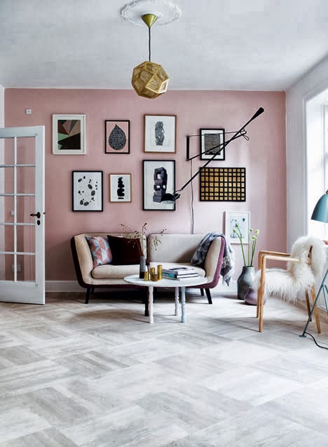
Image credit: My Scandinavian Home, photography by Tia Borgsmidt

Image credit: Bella Mumma

Image credit: Lonny Magazine

Image credit: Decor Pad, Caitlin Wilson design

Image credit: Rue magazine
I hope with the range of looks, tones and uses for pink above you might consider incorporating it into your home. It's a soft, flattering colour which works well in lots of different lights. Plus you can combine it successfully with metallics, black and white styles, bright colours, other pastels and neutrals. It works so well with other colours that it's practially a neutral itself. Ok, maybe not, but it's not far away, so don't be afraid of pale pink. Enjoy the range of tones from soft rose petal blush through ballet slipper up to candy floss. Use it in a glamorous setting, to set off a monochrome style or to soften a contemporary scheme.
However you use it, enjoy it. Which is your favourite picture, would it inspire you to go pink?
Becky
However, I think that if it is used sensitively it can work wonderfully, as these stylish rooms show:
Image credit: My Scandinavian home blog
Image credit: SF Girl by Bay
Image credit: House & Garden, photo by Mel Yates
Image credit: Ikea
Image credit: Inside Out magazine, photo by Sam McAdam-Cooper
Image credit: My Scandinavian Home, photography by Tia Borgsmidt
Image credit: Bella Mumma
Image credit: Lonny Magazine
Image credit: Decor Pad, Caitlin Wilson design
Image credit: Rue magazine
I hope with the range of looks, tones and uses for pink above you might consider incorporating it into your home. It's a soft, flattering colour which works well in lots of different lights. Plus you can combine it successfully with metallics, black and white styles, bright colours, other pastels and neutrals. It works so well with other colours that it's practially a neutral itself. Ok, maybe not, but it's not far away, so don't be afraid of pale pink. Enjoy the range of tones from soft rose petal blush through ballet slipper up to candy floss. Use it in a glamorous setting, to set off a monochrome style or to soften a contemporary scheme.
However you use it, enjoy it. Which is your favourite picture, would it inspire you to go pink?
Becky