Mid-Century Style
A key inspiration for me and my home is mid-century style. I love the colour palette used in the fifties, the shapes and materials used for furniture, the fun graphic patterns and the general sense of life and optimism it holds.
Here are some picks which highlight key aspects of mid-century interiors and tips on how you can introduce them into your own home:

Image credit: Plastolux
A mid-century modern dining room in Denmark filled with the warm wood tones so often seen in this period of design. The almost amber shine of the teak cabinet works perfectly with the white walls and golden glassware. This is a lovely, paired-back, contemporary take on the look.

Image credit: Plastolux
Get the look: If you don't have statement Eames chairs or perfect parquet flooring you can still bring a little bit of this look into your home. Look for a retro teak sideboard, shelving unit or similar and you'll feel the warmth of that beautiful wood.

Image credit: In Good Company blog
Mid-century designers couldn't get enough of yellow and teal. These two colours are paired together in various shades everywhere you look in mid-century interiors. And with good reason. Aren't they fab? The yellow adds a fun, carefree, confident edge while teal brings a sense of opulence and luxury. You'll see these colours combined with neutrals including wood tones, white and grey, or with other mid-century shades including orange, olive green and sometimes a light pink. Look up the Festival of Britain for some great examples.

Get the look: If you want to incorporate some of these colours then the key is that it's all in the tones. A good rule of thumb is that mid-century colours are bold rather than bright, with an ever-so-slightly muted, darker tone to the colour. For example, avoid lemon yellow, think mustard instead. If you're not quite ready for the all-over teal look above then add the colours on key pieces of furniture, as wall colours or with accessories such as cushions and lampshades. However, avoid looking too matchy-matchy by combining at least two of the colours - e.g. mainly mustard but with a splash of teal thrown in with a cushion.

Image Credit: A Little Brassy on Etsy
Some of the most wonderful examples of mid-century modern design are chairs. Like this Ib Kofod-Larsen 'Penguin' rocking chair from 1956, they have wonderful curved lines, bold silhouettes and took advantage of new materials and new methods of production. There are countless examples, from Eames to Panton, and all call to mind that period of boom and bravery after the second world war. Mid-century chairs are immediately recognisable and iconic.

Image credit: Herman Miller
Get the look: Real mid-century designer chairs can be expensive. If you're after an original Eames design then the classic lounger and ottoman combo, as seen above, could set you back over £2500. If you haven't got quite that level of money to invest then think about finding something by a less well-known designer, or an unknown designer, which has that fifties feel. You can pick up bargains at auction houses (I got our set of 6 teak dining chairs with olive green seat pads for around £70), on eBay or in second hand or vintage furniture shops. It doesn't need to be famous to be stylish, but it is better to stick to authentic period pieces rather than reproductions/knock-offs, if you can.

Image credit: Tumblr
The period after WW2 was a wonderful time for surface pattern. Fifties pattern is bold, graphic and often abstract, like the Lucienne Day print above. It uses colour and shape to create beautiful repeats and stylised prints. Mid-century style doesn't have to include pattern, but it's a joy when it does. Whether you prefer the more illustrative style from the fiftes or a bolder, blockier print from the sixties, there's sure to be a pattern to suit.

Image credit: Dwell
Get the look: There's a huge range of mid-century pattern to choose from, and lots of different ways to introduce it into your home. You can pick up some vintage Scandi enamelware, like the bold Cathrineholm range seen above, which is both beautiful and still very useful in the kitchen. You can search out china patterns from designers such as Conran or Jessie Tait and have a few mid-century teacups or coffee pots lying around. Or you can take advantage of the large ranges of vintage wallpaper available online and either paper a feature wall if you're feeling bold, or simply the inside of some shelves if you feel less is more. Another simple way to introduce the look is with a few vintage cushions made from original fabrics (like this one!). There's a massive range of designs and colours to choose from, bold and punchy orange or a simple grey and white print - there's a fifties bark cloth for all tastes!
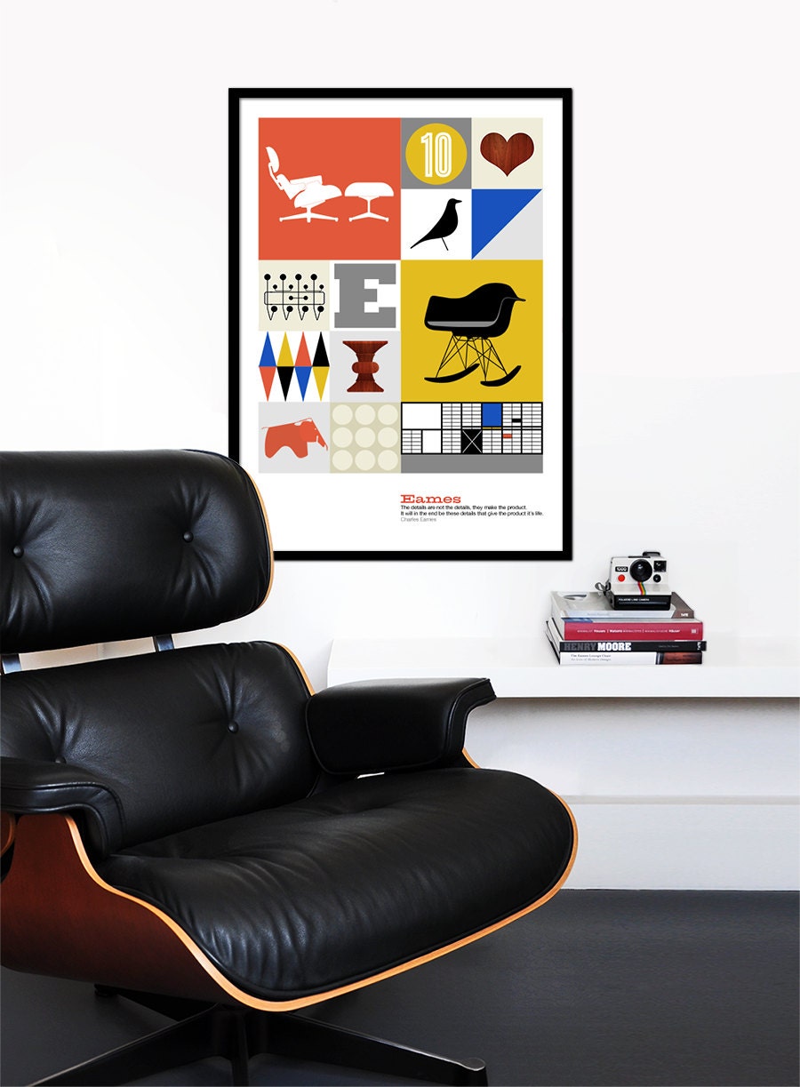
Alternatively, you could always tip a wink to the time period with a piece of modern vintage-inspired art like this print from Yumalum on Etsy:

Image credit: Yumalum
I hope you've enjoyed this quick tour through some classic mid-century style icons and can find a way to introduce this most creative of design periods into your living space.
Because this is a particular passion of mine you'll find some nice mid-century pieces in our shop, including some vintage china, tea towels and cushions. Our vintage range changes regularly as I'm a magpie for a pretty piece of sixties glass or a fifties fabric, so if you do want to introduce the style to your home then we might be able to help! Plus if you need any advice on a vintage piece or where to start I'm happy to help - just ask in the comments and I'll get back to you.
Becky
x
Here are some picks which highlight key aspects of mid-century interiors and tips on how you can introduce them into your own home:
- Gorgeous warm wood tones

Image credit: Plastolux
A mid-century modern dining room in Denmark filled with the warm wood tones so often seen in this period of design. The almost amber shine of the teak cabinet works perfectly with the white walls and golden glassware. This is a lovely, paired-back, contemporary take on the look.

Image credit: Plastolux
Get the look: If you don't have statement Eames chairs or perfect parquet flooring you can still bring a little bit of this look into your home. Look for a retro teak sideboard, shelving unit or similar and you'll feel the warmth of that beautiful wood.
- Yellow & Teal every time

Image credit: In Good Company blog
Mid-century designers couldn't get enough of yellow and teal. These two colours are paired together in various shades everywhere you look in mid-century interiors. And with good reason. Aren't they fab? The yellow adds a fun, carefree, confident edge while teal brings a sense of opulence and luxury. You'll see these colours combined with neutrals including wood tones, white and grey, or with other mid-century shades including orange, olive green and sometimes a light pink. Look up the Festival of Britain for some great examples.

Get the look: If you want to incorporate some of these colours then the key is that it's all in the tones. A good rule of thumb is that mid-century colours are bold rather than bright, with an ever-so-slightly muted, darker tone to the colour. For example, avoid lemon yellow, think mustard instead. If you're not quite ready for the all-over teal look above then add the colours on key pieces of furniture, as wall colours or with accessories such as cushions and lampshades. However, avoid looking too matchy-matchy by combining at least two of the colours - e.g. mainly mustard but with a splash of teal thrown in with a cushion.
- Chairs are the key

Image Credit: A Little Brassy on Etsy
Some of the most wonderful examples of mid-century modern design are chairs. Like this Ib Kofod-Larsen 'Penguin' rocking chair from 1956, they have wonderful curved lines, bold silhouettes and took advantage of new materials and new methods of production. There are countless examples, from Eames to Panton, and all call to mind that period of boom and bravery after the second world war. Mid-century chairs are immediately recognisable and iconic.

Image credit: Herman Miller
Get the look: Real mid-century designer chairs can be expensive. If you're after an original Eames design then the classic lounger and ottoman combo, as seen above, could set you back over £2500. If you haven't got quite that level of money to invest then think about finding something by a less well-known designer, or an unknown designer, which has that fifties feel. You can pick up bargains at auction houses (I got our set of 6 teak dining chairs with olive green seat pads for around £70), on eBay or in second hand or vintage furniture shops. It doesn't need to be famous to be stylish, but it is better to stick to authentic period pieces rather than reproductions/knock-offs, if you can.
- Graphic patterns

Image credit: Tumblr
The period after WW2 was a wonderful time for surface pattern. Fifties pattern is bold, graphic and often abstract, like the Lucienne Day print above. It uses colour and shape to create beautiful repeats and stylised prints. Mid-century style doesn't have to include pattern, but it's a joy when it does. Whether you prefer the more illustrative style from the fiftes or a bolder, blockier print from the sixties, there's sure to be a pattern to suit.

Image credit: Dwell
Get the look: There's a huge range of mid-century pattern to choose from, and lots of different ways to introduce it into your home. You can pick up some vintage Scandi enamelware, like the bold Cathrineholm range seen above, which is both beautiful and still very useful in the kitchen. You can search out china patterns from designers such as Conran or Jessie Tait and have a few mid-century teacups or coffee pots lying around. Or you can take advantage of the large ranges of vintage wallpaper available online and either paper a feature wall if you're feeling bold, or simply the inside of some shelves if you feel less is more. Another simple way to introduce the look is with a few vintage cushions made from original fabrics (like this one!). There's a massive range of designs and colours to choose from, bold and punchy orange or a simple grey and white print - there's a fifties bark cloth for all tastes!
Alternatively, you could always tip a wink to the time period with a piece of modern vintage-inspired art like this print from Yumalum on Etsy:

Image credit: Yumalum
I hope you've enjoyed this quick tour through some classic mid-century style icons and can find a way to introduce this most creative of design periods into your living space.
Because this is a particular passion of mine you'll find some nice mid-century pieces in our shop, including some vintage china, tea towels and cushions. Our vintage range changes regularly as I'm a magpie for a pretty piece of sixties glass or a fifties fabric, so if you do want to introduce the style to your home then we might be able to help! Plus if you need any advice on a vintage piece or where to start I'm happy to help - just ask in the comments and I'll get back to you.
Becky
x
